Modern UI design often swings between bold experimentation and functional minimalism. One trend that sits stylishly at the center of this spectrum is glassmorphism — a design style inspired by frosted-glass aesthetics, layered transparency, and soft shadows.
From Apple’s macOS Big Sur interface to modern fintech apps and sleek dashboards, glassmorphism has made its mark. But is it more than just a visual gimmick? Does it help or hinder user experience?
In this blog, we explore what glassmorphism really means in UX/UI, where it works well, and when to avoid it — so designers, product teams, and marketers can make more informed creative decisions.
What Is Glassmorphism?
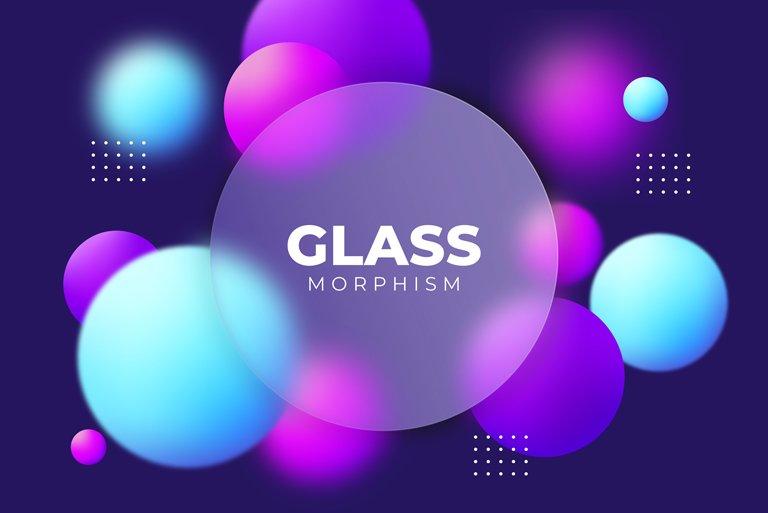
Glassmorphism is a visual design style that mimics the appearance of translucent, blurred glass layered over a background. It’s known for:
-
Frosted blur effects
-
Translucent panels
-
Soft, diffused light
-
Floating interface layers
-
Subtle shadows and gradients
The goal is to create depth and hierarchy, offering users a sense of spatial orientation without relying on heavy lines or solid shapes.
While the style is often described as futuristic, it actually borrows cues from earlier skeuomorphic and neomorphic design eras — but with cleaner, more responsive implementation in today’s digital interfaces.
Why Glassmorphism Is Trending Again
Before diving into pros and cons, it’s important to understand why this trend is gaining popularity:
-
Visual Novelty: In an era of flat design fatigue, glassmorphism offers freshness.
-
Emotional Appeal: The aesthetic evokes elegance, depth, and sophistication.
-
Hardware Compatibility: Modern devices can render blur and translucency smoothly, enabling this effect without performance compromise.
Where Glassmorphism Works Well
Used intentionally, glassmorphism can elevate digital products in meaningful ways. Below are situations where it delivers both style and function:
• High-End Consumer Interfaces
Premium product pages, fashion ecommerce, and digital lifestyle brands use glassmorphism to convey class and minimal sophistication without visual clutter.
• Dashboards and Admin Panels
Glassmorphic cards can organize information into layers, helping the user focus on key sections while creating aesthetic separation from the background.
• Dark Mode Interfaces
The blurred, translucent effect often shines (literally and figuratively) in dark UI settings, providing depth and contrast without harsh outlines.
• Mobile OS and Apps
Mobile interfaces, especially iOS widgets and overlays, use glassmorphism to keep interfaces consistent, clean, and layered — enhancing usability without overwhelming the screen.
The Pros of Glassmorphism in UI Design
When done right, glassmorphism isn’t just eye-candy — it supports usability, hierarchy, and emotional connection.
• Enhances Visual Hierarchy
By layering translucent panels over rich backgrounds, designers can naturally separate content without using borders or hard lines.
• Delivers a Premium Aesthetic
Glassmorphism conveys a sense of modernity and refinement, which is why it’s often found in luxury apps, fintech platforms, and lifestyle brands.
• Focus Through Blur
Background blur subtly draws the user’s eye toward the content in the foreground, increasing focus and reducing distraction.
• Compatible With Minimalism
Despite its layered visuals, glassmorphism can complement minimalist UI by using fewer visual cues while still maintaining user guidance and flow.
• Encourages Micro-Interaction Delight
Transitions, hover effects, and click responses using glassmorphism feel more fluid and natural, enhancing the micro-experience of users.
The Cons of Glassmorphism in UI Design
But not everything shiny is golden. Glassmorphism has its drawbacks — especially if overused or implemented poorly.
• Accessibility Challenges
The use of semi-transparency, low contrast, and blurred backgrounds can be a nightmare for users with visual impairments or older screens with poor rendering.
• Performance Issues
Rendering real-time blur and shadow effects can be taxing on low-powered devices, particularly budget mobiles or older web browsers.
• Background Dependency
The style relies heavily on background visuals. If the background is too busy, the effect loses clarity; if too bland, it looks flat.
• Reduced Readability
Overuse of frosted-glass elements may cause legibility issues, especially for text-heavy interfaces where clarity is crucial.
• Visual Fatigue in Complex Interfaces
In dense applications with a lot of information (e.g. SaaS tools, CRMs), glassmorphism can add unnecessary complexity and slow the user down visually.
Best Practices to Use Glassmorphism Responsibly
While you may choose not to implement the style directly, understanding how to control it is key. Here’s how to ensure it doesn’t compromise UX:
-
Use Sparingly: Apply glassmorphism to key interface components (cards, modals) instead of across the entire layout.
-
Ensure High Contrast: Maintain clear readability by using high-contrast foreground text or icons.
-
Test Across Devices: Make sure blur effects render well on mobile, tablets, and older devices.
-
Balance Aesthetics with Function: If it looks great but confuses users or causes lag — reconsider.
-
Consider Accessibility First: Use accessibility plugins or manual testing to ensure WCAG standards are met.
The UXMagik Take
At UXMagik, we believe design should always serve the user first. While glassmorphism can deliver beauty, delight, and modernity, it should never come at the cost of clarity, performance, or accessibility.
We’ve helped brands across industries incorporate new-age design trends in a way that supports their business goals — not just visual polish. That’s where hybrid design thinking comes in — where data, aesthetics, and user psychology meet.
Conclusion
Glassmorphism is not just a fleeting trend — it’s a visual tool. Like any tool, its effectiveness depends on the craftsman. Used wisely, it can create depth, focus, and emotion. Misused, it becomes noise.
The key is balance. Understand your users. Know your brand tone. Then decide whether glassmorphism aligns with your UX goals or not.
When clarity, hierarchy, and elegance align, glassmorphism can be magic. But only when it’s grounded in user needs — not just visual appeal.
FAQs: Glassmorphism in UI Design
1. What is the main difference between glassmorphism and neomorphism?
Glassmorphism focuses on transparency and background blur effects, while neomorphism emphasizes soft shadows and extruded elements to mimic physical depth. Glassmorphism feels lighter and more layered, whereas neomorphism mimics real-world lighting and textures.
2. Is glassmorphism bad for accessibility?
Yes, it can be — especially if there’s low contrast between foreground and background. Always test your UI for WCAG compliance and ensure readability on all devices.
3. Can glassmorphism be used in mobile apps?
Absolutely. It’s often used in iOS apps and mobile interfaces, but ensure it doesn’t impact app performance or battery life due to real-time blur rendering.
4. Is glassmorphism suitable for corporate websites?
If used subtly, yes. A light touch on callout cards, footers, or hero overlays can create elegance. Avoid full-page glassmorphism in professional settings unless it aligns with brand identity.
5. How does glassmorphism impact performance?
Real-time blur and transparency require more GPU power. On lower-end devices or complex web applications, this could lead to lag. Test for performance across devices before going live.